Inspiration
Find out how to use this year's Pantone colors in the home
Each year's “Pantone Color of the Year” has inspired professionals from the world of interior design. Let us give you a few tips on how to use this Pantone Colors of the Year in the home
For two decades now, each year's “Pantone Color of the Year” has inspired professionals from the world of interior design, setting a new trailblazing trend on each occasion.
To choose the “Pantone Color of the Year", experts from the Pantone Color Institute conduct a yearly market analysis of new influences, lifestyles, socio-economic conditions and even technological developments.
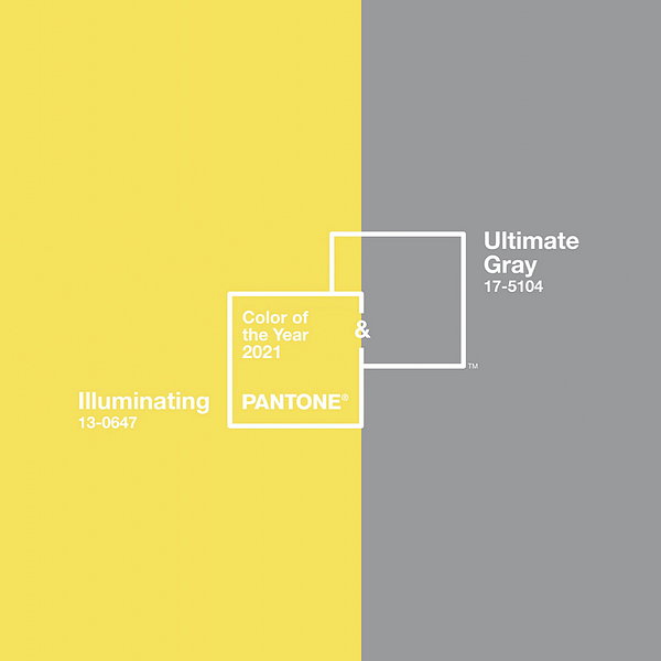
This year, they have surprised us with a combination of two colors: Pantone 17-5104 Ultimate Gray + Pantone 13-0647 Illuminating. This mix conveys a sensation of strength, hope and dynamism–just the right choice in the current scenario!

Pantone 17-5104 Ultimate Gray + Pantone 13-0647 have an uplifting effect, highlighting the need for visibility. It is a color combination closely associated with the concepts of innovating, intuition and experience.
Let us give you a few tips on how to use this year's Pantone Colors of the Year in the home:
Go for gray
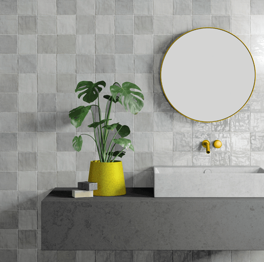
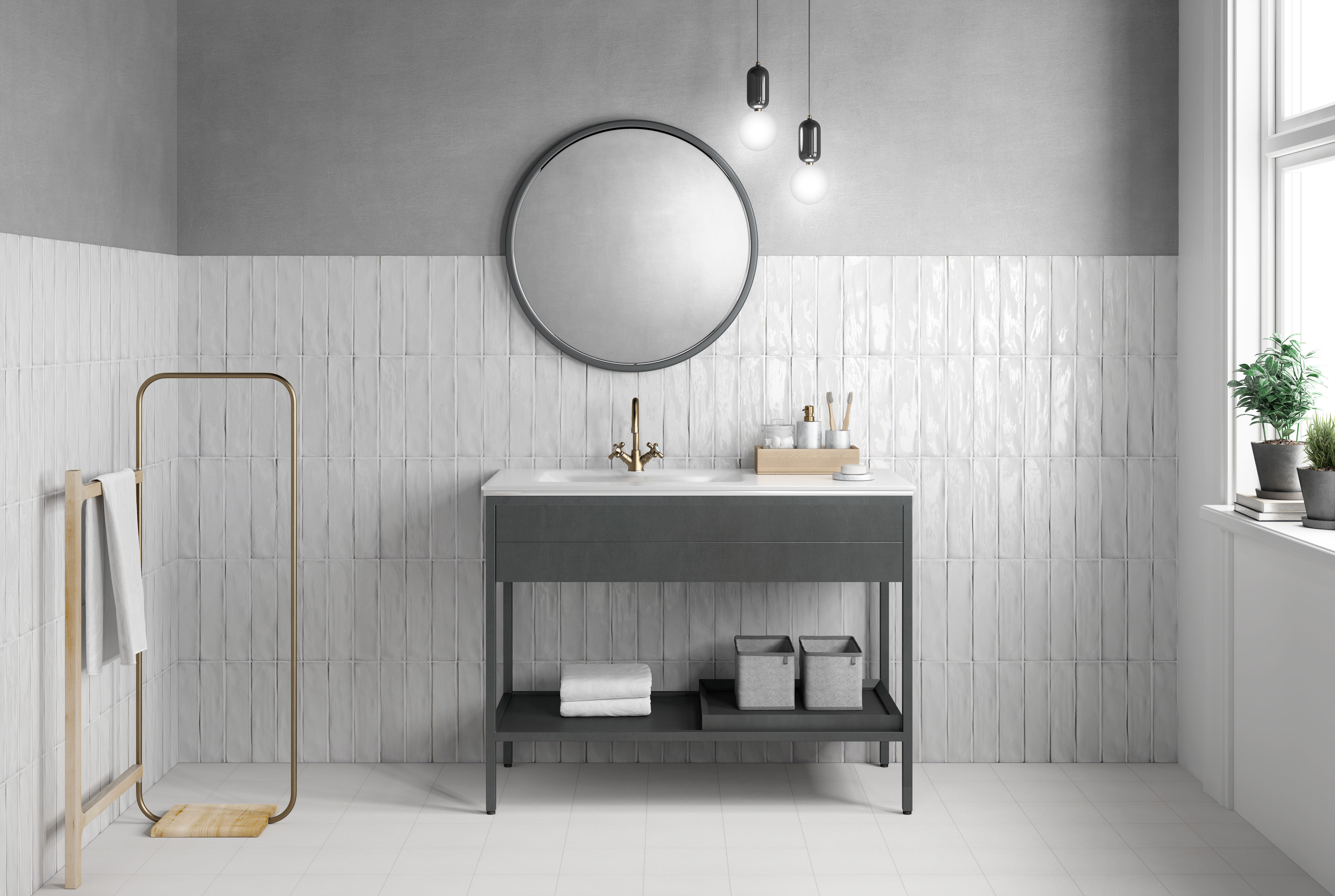
One good way of combining this year's Pantone colors is to choose gray for your wall or floor tiles–indeed, this is one of 2021's major trends. Because gray is a neutral color, it serves to highlight the rest of the décor.
The “Pasadena” collection by Harmony comes in a choice of neutral shades that can be combined with whites or grays to create an Ultimate Gray backdrop.
“This is a color combination that gives us resilience and hope. We need to feel encouraged and uplifted, this is essential to the human spirit”, In the words of Leatrice Eisdeman, the Executive Director of the Pantone Color Institute.
Furniture in gray and yellow
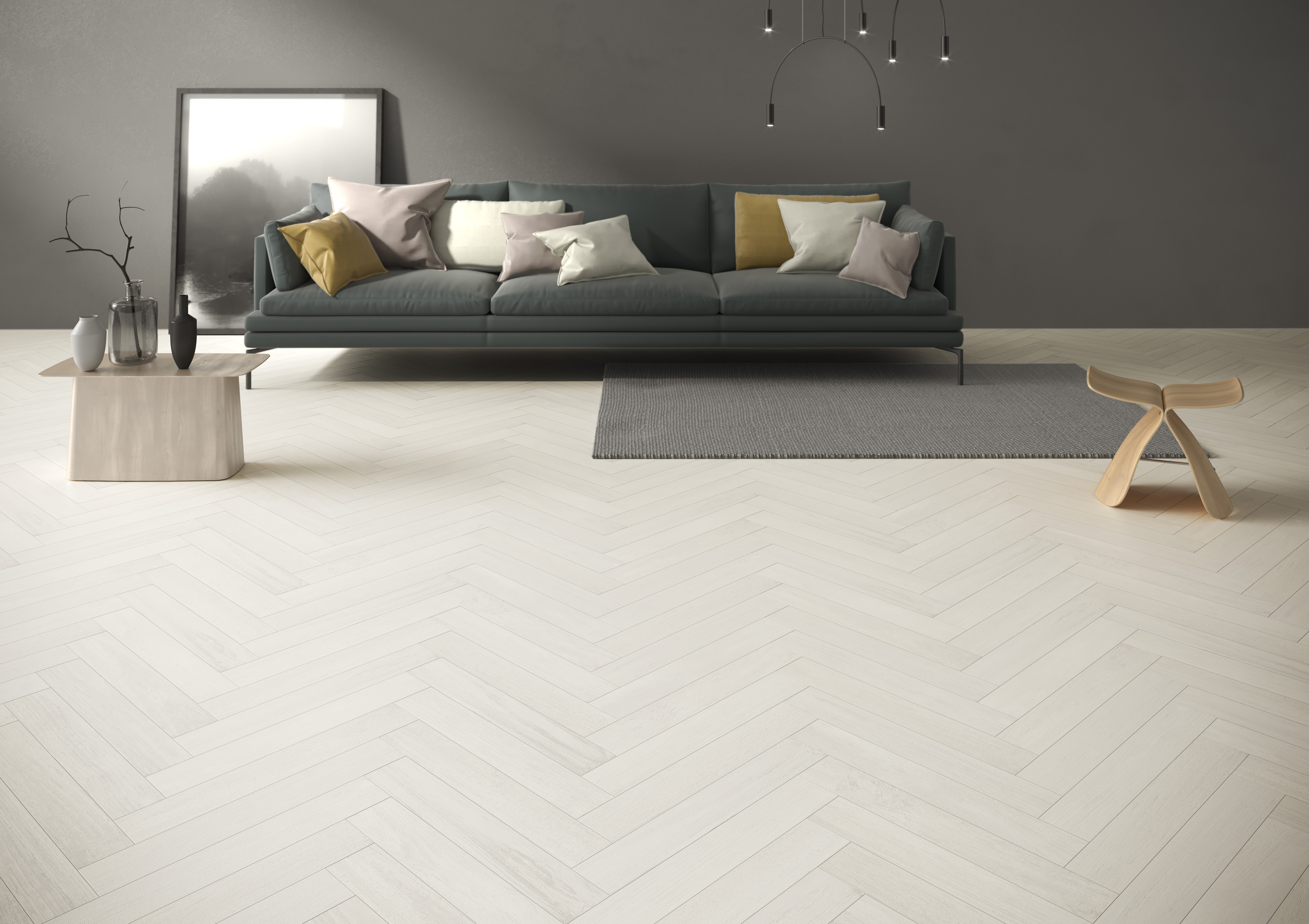
Living spaces in neutral colors, like white, gray or black, can be given a strong contemporary feel by using furniture in shades of Ultimate Gray or Illuminating. The perfect mix is a neutral setting in shades of gray, with contrasting decorative touches designed to add a dash of light and color.
The “Riad” collection by Harmony features wall tiles like the ones shown here, combinable with gray furniture and decorative features that add a splash of Illuminating.

This new colour combination, which has started to be seen in interior design in recent years, is an eye-catching mix, perfect for creating cheerful interiors with a ground-breaking appeal.

